Basic Map
By Sylvain Beaud, Julie Djeffal & Timothée Lottaz
Data acquisition and cleaning
We started by creating some jupyter notebooks to explore, pre-process and clean the data we downloaded from the UN Comtrade Database. For the time being, we choose specific products to be presented in our stories, so we downloaded the data by hand but an API is also available. The majority of the data that can be extracted from the UN Comtrade Database are relatively clean. Most of the pre-processing steps can be summed up by:
- Selecting data of interest
- Keeping only relevant features
- Concatenating the datasets to be able to access multiple years.
First prototype
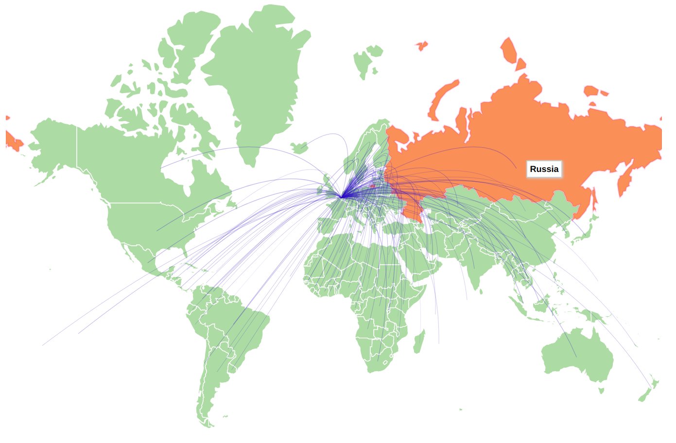
We created a first version of our map using Datamaps. Having this first prototype enabled us to assess the relevance of the preprocessing steps, we had done so far. This first map gave us a concrete base to work on and a better idea of the elements and features which needed to be included later.

First real map
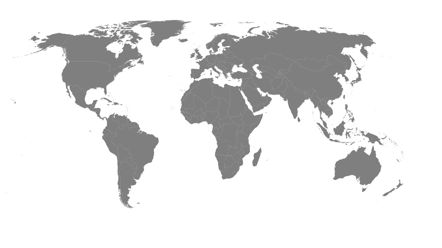
As soon as we got a clearer plan for the continuation of the project. We switched to customized svg and obtained this simple map.

First network
We decided to use Cytoscape to create the graph representing the trades interactions. There were a few issues to solve at this point, first we had to map the layout of the graph to the real geographical coordinates of the country. Then, we had to make a choice about the obvious tradoff between the amount of informations and edges to display and the readability of the graph. We decided, for the time being, to fix an arbitrary threshold to discriminate between the main importers of a given product and the rest of the countries. At last but not least, we needed to find a way to bound the map to the graph.