Enhanced Map
By Sylvain Beaud, Julie Djeffal & Timothée Lottaz
First user interface
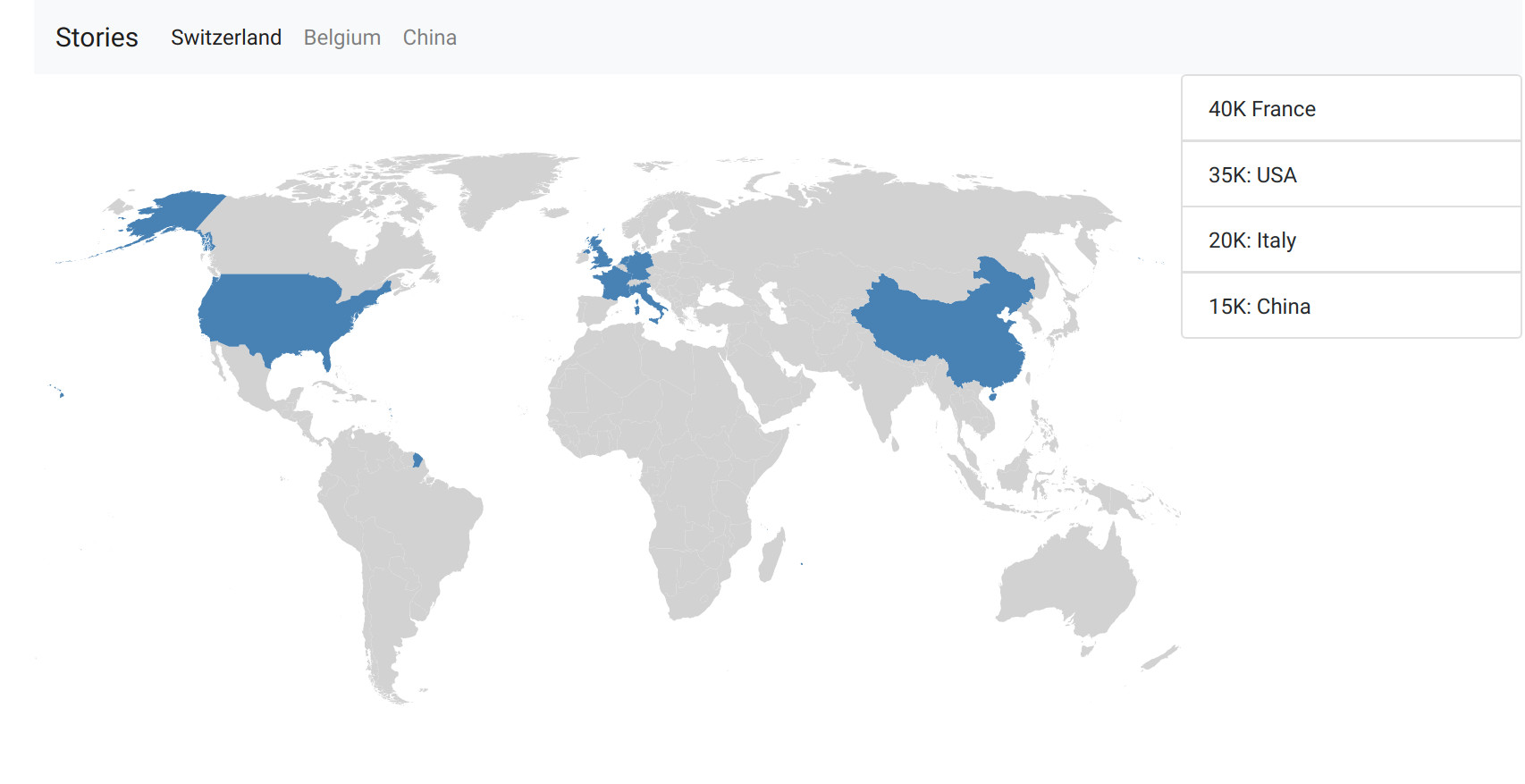
We added some user interface elements to enable the navigation between the stories we decided to show. We introduced an information pane on the right of the screen to display a summary of the main data. We also changed the display of the main traders on the map.
Merging the map and the graph
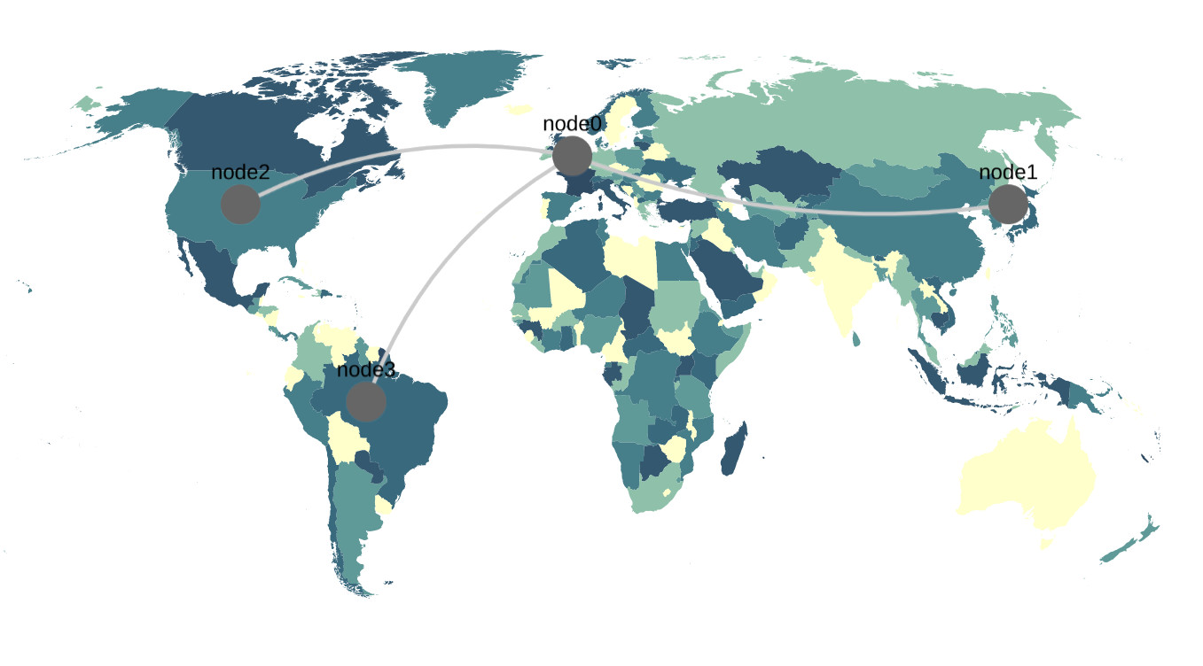
Merging the network of trades with the map was quite a hard task. Since the network of trades (cytoscape) and the map are two different components on top of each other, it was impossible to allow the user to interact with both, without a big hack. We initially wanted to display informations on the countries *and* on the trade arrows. We finally took the choice of keeping it simple, and disable all interactions with the arrows. This way, even the “small importers” can be inspected at will.
The Timeline
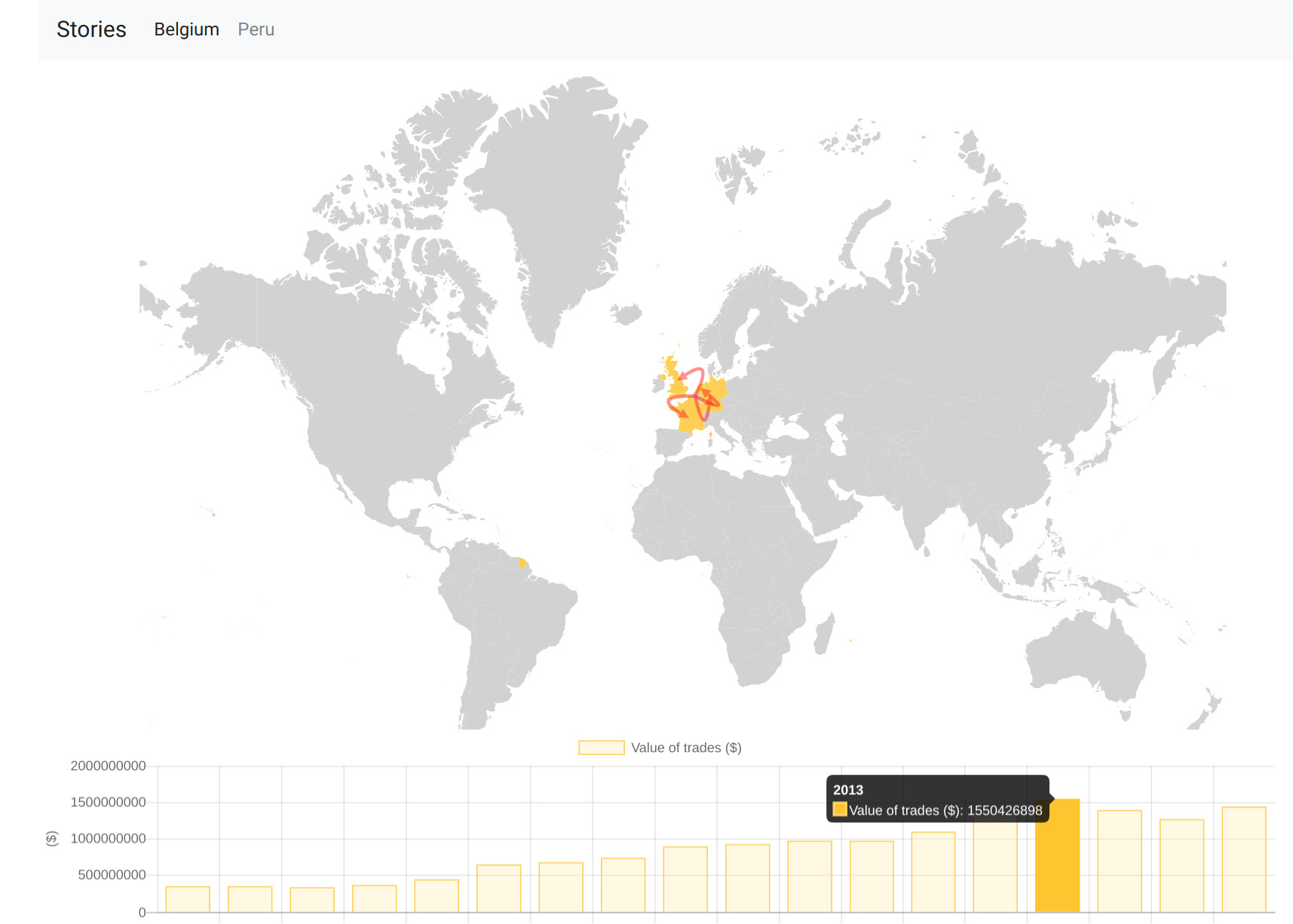
The next step was the implementation of a timeline showing the total of exports by year related to a given story. We added some interactions so that the user can select a specific year and the associated data will be displayed on the map. At this point, we decided to get rid off the information pane and to replace it by a tooltip as explained in the next section.
The Tooltip
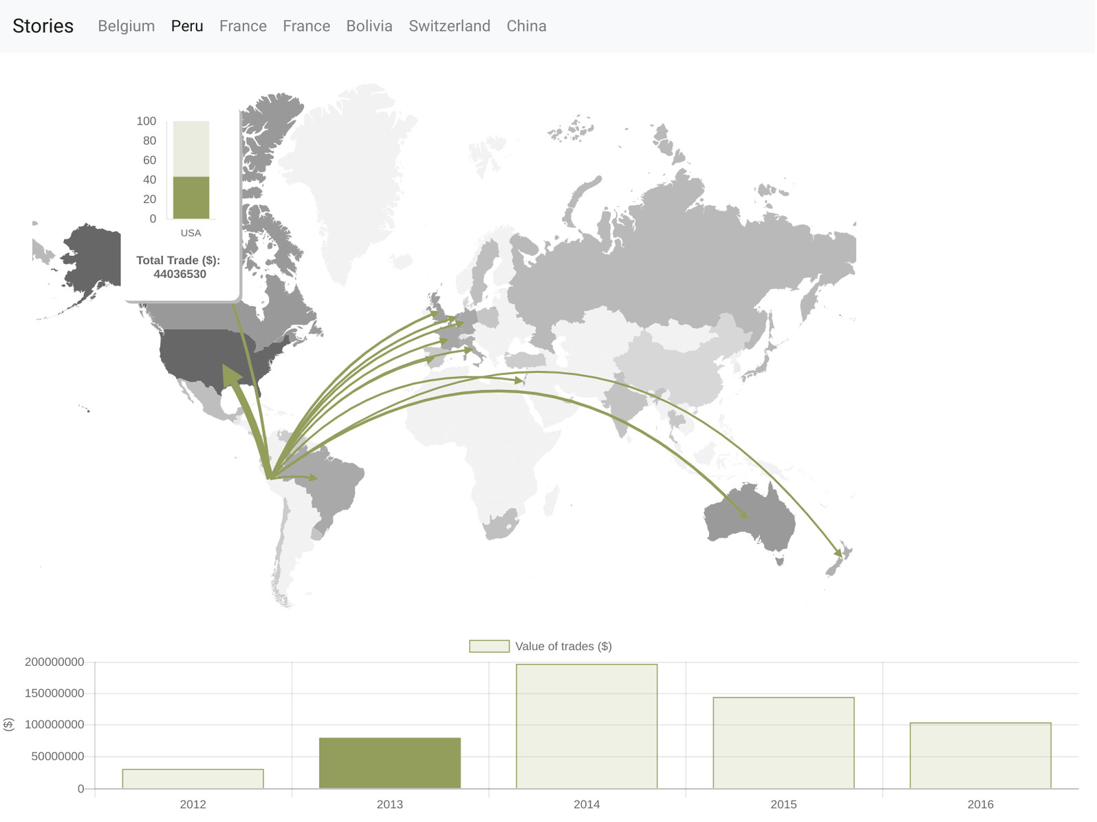
We wanted informations about "small traders" to also be available. We thus created a tooltip that appears when the mouse is over a country, to inspect it and get simple trade informations. We also colored each country depending on its trade value, which makes the map more esthetic, but also gives direct infos for all countries. Then we modified the tooltip to also show the proportion of the trade compared to the total trade value of the year.
The Country card
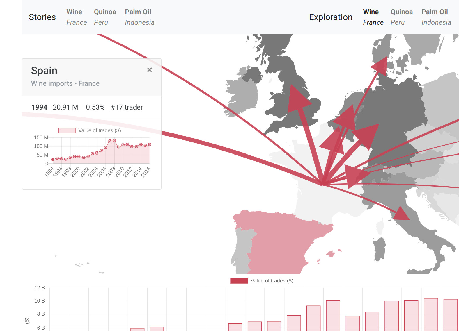
Then, we decided that the easiest way for the user to access the main information related to a country was to add a proper country card which would replace the tooltip. This card shows up when the user clicks on a country and displays useful information such as the exact total value of the trades or the country rank for a given year. The graph shown in the country card can also be used to navigate through the years.
The Controls
Initially, we wanted the map to be fixed at the world level, to always have an overview of the trades. But we had a problem with the big traders located near the exporter: those arrows are short and large, which makes the whole region a mess. We thus introduced map controls: zooming and panning. It was difficult because we had to map Cytoscape’s zooming function to D3, but when it worked the whole visualisation was a lot more interactive, and cooler to use !